Pizza Hut 2013 Redesign
A UI/UX redesign project analyzing a pre-2018 digital product with usability issues. Through UI audit, competitor research, and SCAMPER strategy, this project focuses on improving a key user task with a more intuitive and user-centered interface.
Scalability + Adaptability
The layout appears fixed and visually dense. It does not adapt well to different screen sizes.


Simplicity + Consistency
Having to scroll horizontally to see the full operating hours adds unnecessary complexity. The hours should be placed directly under the address so users can view all essential information at once.
Simplicity + Consistency
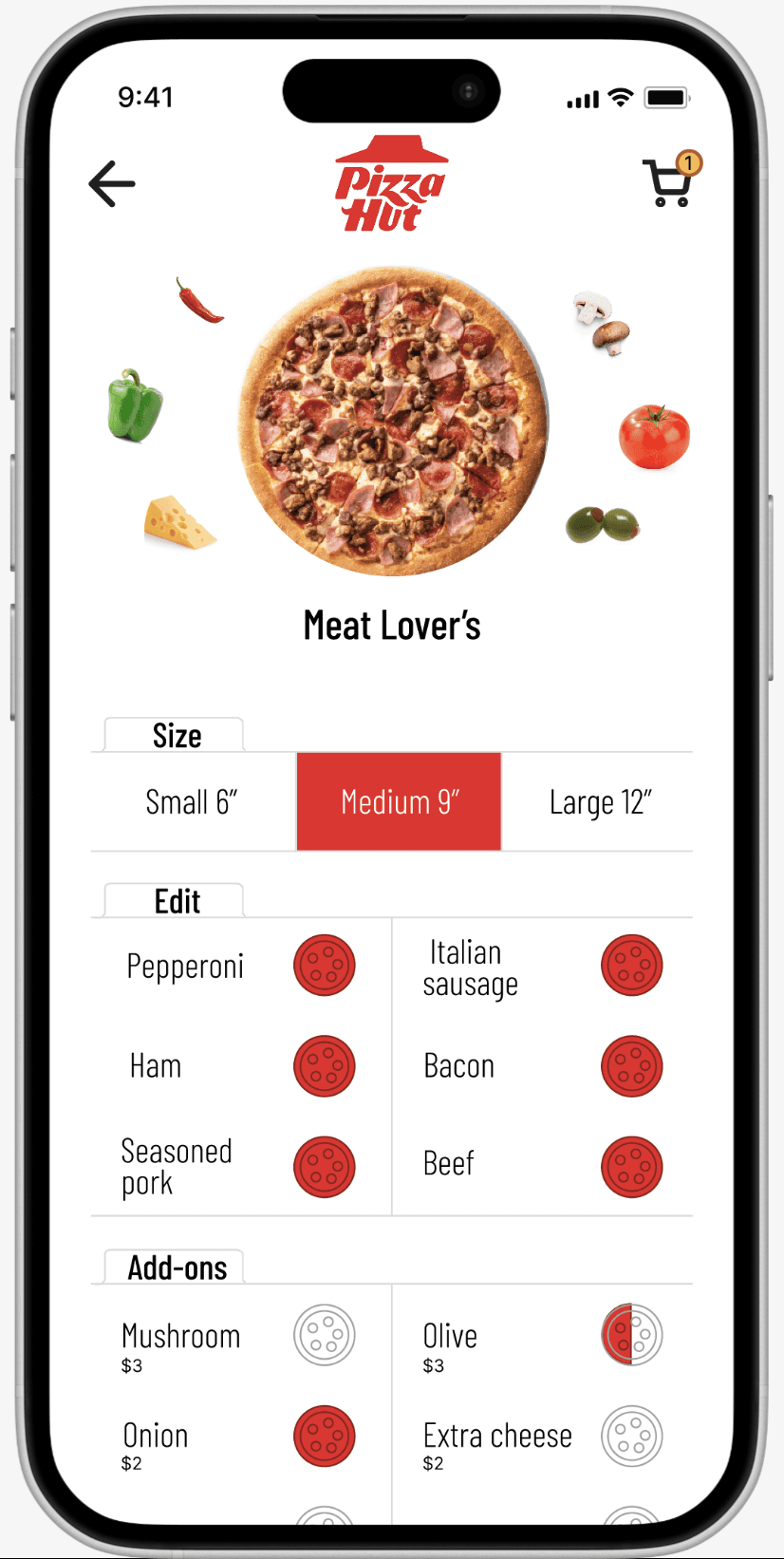
Topping descriptions should be visible without an extra click, using short labels like “EXTRA pepperoni and cheese.”
Clarity + Contrast
The overuse of red throughout the app creates eye strain and makes the interface feel overwhelming.


Visual Hierarchy + Alignment
Promotional banners and primary actions compete for attention. Inconsistent spacing crowded alignment create visual clutter. Log in button could be placed under the dine in button.
Key Principle Analysis
UI Audit Report
Redesign
Over saturated design
Using too much red throughout the interface can overwhelm users and increase visual strain.
Pain Point 1
Inefficient ordering flow
Unnecessary steps to view product details frustrate users and delay checkout, increasing cart abandonment.
Pain Point 2
Lack of clear text structure
Truncated text makes it difficult for users to access the full content.
Pain Point 3
Target Audience
Business Goal
The primary target audience is busy young adults and families between the ages of 18–40 who frequently order food through mobile devices. These users are digitally fluent and expect fast, intuitive experiences. Many are ordering while multitasking or when they are hungry, so speed and simplicity are essential. The design must support quick decision-making with minimal effort.
Improve Ordering Efficiency
Reduce selection errors and confusion by simplifying menu presentation.
Increase Mobile Order Conversion Rate
Streamline the ordering flow to reduce increase completed purchases.
Strengthen Brand Perception
Reposition Pizza Hut as a modern, user-friendly mobile brand.
Competitors
Direct competitors include Domino’s and Papa John’s mobile apps. Papa John’s emphasize faster ordering and clearer menu structures. Third-party platforms such as Grubhub also compete for user attention by offering multiple restaurant options in one place. Additionally, users face distractions from social media notifications, multitasking, and short attention spans. If the ordering process feels slow or confusing, users are likely to abandon the app and switch platforms immediately.